I’ve recently been through the process of getting all three of my thrillers turned into fantastic quality, professionally designed print books, and I’m really pleased with the results.
In today’s interview, my interior designer, Jane Dixon Smith talks about some of the important elements of design.
In the intro, I talk about linking your Goodreads reviews to Kobo, how the UK publishing industry is embracing self-publishing and give you an update on my rewrites plus book-bindingand more.
** UPDATE: Since I recorded this only a few days ago, Amazon has bought Goodreads. They have promised to keep the feed to Kobo but basically what I’m suggesting may not work going forward regarding reviews. **
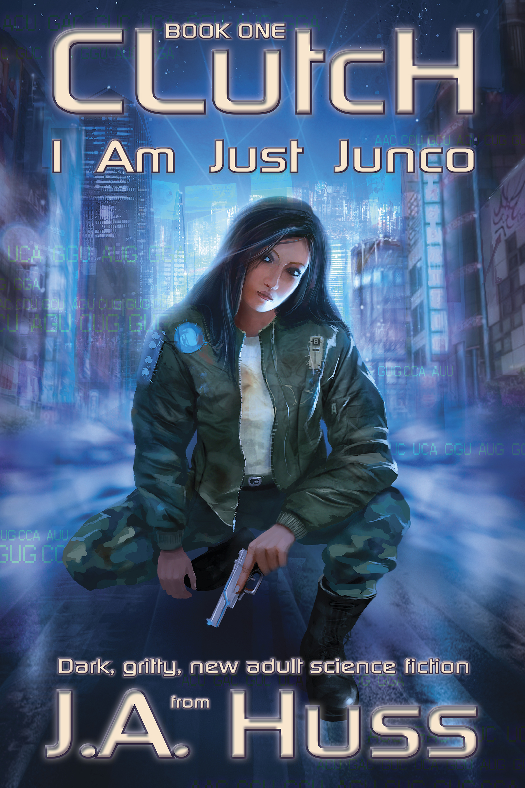
Today’s Podcast Sponsor: Clutch: I am just Junko by J.A. HussI am just Junco. Behind me is a past better left dead, and in front of me is a future I’d rather not meet–because my life is nothing but lies.
Buy now on Amazon or Barnes & Noble.
Find out more on sponsoring the podcast here.
Interview with Jane Dixon Smith:JD Smith is a graphic designer for book covers and interiors as well as other branding materials. She’s also the author of historical fiction and the editor of Words With Jam.
- How Jane’s writing career has progressed from writing for pleasure to starting Words with Jam, a writing magazine. She has worked in graphic design for 13 years and last year went freelance, working with predominantly authors she has met through the magazine. She’s just finished her first historical novel, Tristan and Isolde which will be coming out mid 2013.
- What are the graphic elements that authors get wrong that mark them out as amateur? Imagery and typography are the main elements and most people don’t get typography right, even if they pick a good image. If you can’t use Photoshop professionally, don’t use it! Color matching needs to be done in the right way. Don’t use the fanciest font your can find as it needs to be legible.
- Author branding needs to be good on websites as well as cover design. Use a good pro template on your author website. By portraying a professional image, you will look ‘more important’ that not. Cluttering and the black background are two major issues with many author websites. Make it clean and easy to read. Space out your text and make it easy to read.
-
This was the font I saw on a thriller that I really like!
On typography. There are font designers and new fonts being released all the time. I mention a recent Kickstarter for a font based on Sigmund Freud’s handwriting (cool!) For the interior of your book, it needs to be plain and easy on the eye. Jane uses similar variations to Times, Garamond, Caslon – plain and easy to read. The interior font shouldn’t even be noticeable. Jane recommends checking out Fontsquirrel and MyFonts.com.
- Why covers are so important in attracting readers and setting their expectations around quality. All your author branding needs to convey quality and professionalism.
- Why professional interior formatting can make a huge difference in the look of your print book. In the video, I show some of the pages of Pentecost and the aspects I love like the extra images, typography and the way the page numbers and headers are formatted. We talk about font size and typography that will make a difference to the length of your work and cost of printing as well as readability.
- Jane talks about making a print book a more highly valued product e.g. adding in special elements or adding a short story as well as investing in the quality of the book so people want to buy print as well as ebook versions.
- Interior formatting is not something I have the patience to do on my own and it’s very hard with MS Word, so usually you need a professional program to get it right. (If you want to DIY, try Joel Friedlander, The Book Designer, who now has a whole load of print and ebook design templates that you can buy for a very reasonable price.)
- You can find ‘royalty free’ stock images online – Jane recommends iStockphoto.com and Shutterstock.com, Thinkstock and also 123RoyaltyFree. It depends on the budget and what she’s looking for. If you want images that will resize without losing quality, try VectorStock. Remember that you need to use high-resolution images, 300dpi for printing. This also relates to your own photos if you want to use those.
- We talk about the iterative process of design and also the file upload process on Createspace and other sites. Sometimes there are warnings and errors when files are loaded, that’s quite normal in the process.
- Jane is part of the Triskele Books author collective, a group of authors with books around ‘time and place’ who work together with beta-reading and marketing. They all keep their own rights and are all self-published, but they reap the benefits of a collective approach.
You can find Jane at JDSmith-Design.com as well as at WordsWithJam.co.uk and TriskeleBooks.co.uk
Do you have any questions around design or typography? Please do leave them below.

